
Most dashboards are art galleries for charts. They get curated, framed, hung on a wall, and quietly ignored. The CFO opens them on Monday morning, scrolls for thirty seconds, finds nothing actionable, and closes the tab. The marketing director glances at them in standup, mentions a number nobody can verify, and moves on. The CEO clicks through quarterly to make sure the dashboards still exist. They always do, and they rarely change anyone's behavior.
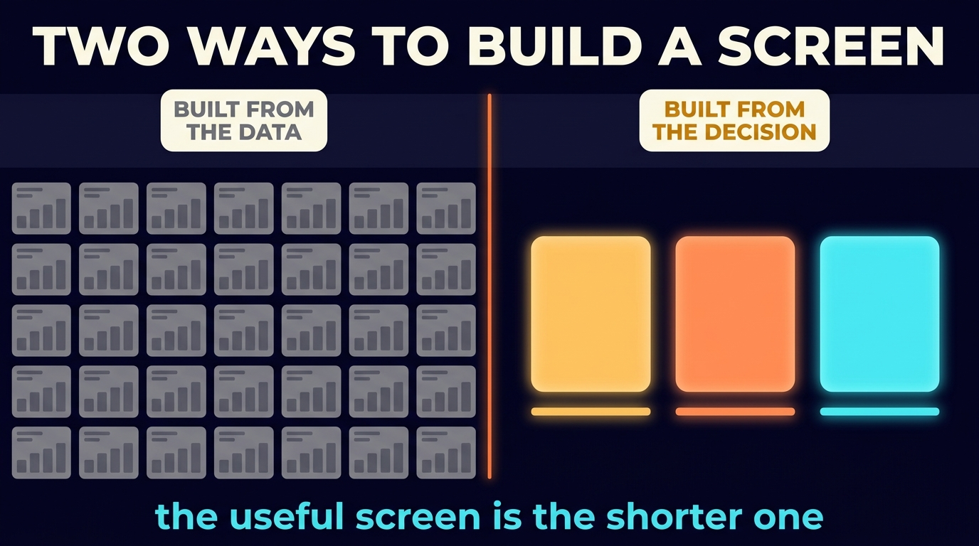
Those dashboards were built around the data instead of the decision. Whoever built them started with here is what we have access to and ended with here is everything we can show. What comes out is a wall of fifty charts that collectively answer nothing, because nobody asked a specific question.
Decision-driven dashboards work the opposite way. The starting question is what is the operator about to decide? The dashboard is built backward from that decision. Every chart, every number, every threshold either feeds the decision or it doesn't exist on the page. The result is a dashboard with three numbers above the fold, two supporting cuts, and a deliberately empty bottom of the screen, because the decision is already made by the time the operator scrolls. This playbook for building that dashboard sits in the Business Intelligence cluster, downstream of the data engineering covered in Source to Model, Observed.
Why the chart graveyard exists
The cause is structural: most dashboards get built by people who don't own the decision the dashboard is supposed to support. The data team builds what the data team can build. The visualization tool offers fifty chart types and the analyst tries every one of them. Stakeholders ask for additions, and nobody removes anything because removing a chart feels political. Six months later the dashboard has eighty visual elements, every one of them technically correct, and collectively they tell the operator nothing.
That way of building is the inverse of how an operator decides. An operator decides by ranking options. They ask should I increase the ad budget on Channel A or shift it to Channel B? The number that answers that question is one number, derived from the data, presented at a comparable scale, with a threshold for action. Everything else is context, and context belongs below the fold or in a drilldown, not above it.
The Notion portfolio frames the failure precisely: dashboards may look pretty, but nobody can explain which campaigns, offers, or customers actually drive profit. The pretty dashboard is the failure mode. A useful dashboard has to make one specific decision faster, and it can do that without being pretty.
The three numbers that change behavior
Three is the load-bearing constraint. Two numbers feel incomplete, and the operator wonders what they're missing. Put four on the screen and the eye starts ranking, so the fourth number always feels like clutter. Three numbers fits human working memory at a glance, leaves breathing space on the screen, and forces the dashboard owner to make hard ranking choices about what matters most.
Each of the three numbers carries three properties.
It's a number the operator can act on. If the number changes, the operator changes what they do. Cost per acquisition went from $80 to $95 last week is actionable; the operator can audit creatives, channels, or audiences and respond. Pageviews increased 8 percent isn't actionable for most operators because it doesn't map to a budget decision or a campaign change.
It carries a threshold. The number means something only against a comparison: a target, a prior period, a benchmark, or a tripwire. CAC is $95 is data. CAC is $95 against an $80 target with a $120 walk-away threshold is a decision. The dashboard makes the threshold visible. Color, position, and visual weight communicate where the number sits in the action zones (green for safe, amber for watch, orange for act-now).
It's fresh enough to act on. A number from last quarter is history. A number from yesterday is operational. The freshness floor depends on the decision cadence. Weekly budget decisions need daily data. Monthly retention decisions can run on weekly data. The dashboard states its freshness outright, against the freshness SLA (a stated limit on how old the data may get) covered in Source to Model, Observed. Last updated 2 hours ago is part of the dashboard, not a footer afterthought.
The hierarchy of charts on the page
A decision-driven dashboard has four layers, each with a specific job.
Layer 1: the three hero numbers. They sit above the fold in large type, color-coded against thresholds, with the freshness timestamp visible. They're the first thing the operator sees and the first thing they react to. If the operator only ever looks at this layer, the dashboard has done its job.
Layer 2: trend. Each hero number gets one sparkline or one small line chart showing the last 30, 60, or 90 days. Trend gives context: is the number improving, deteriorating, or noisy? The trend chart stays small and off the focal point. It exists to answer the operator's second question: is this getting better or worse?
Layer 3: segment cut. One drilldown per hero number breaks the metric down by the most actionable dimension: CAC by channel, LTV by acquisition cohort, payback by campaign. The segment cut is what the operator clicks into when one of the hero numbers is off and they need to know why. It stays collapsed until the operator engages.
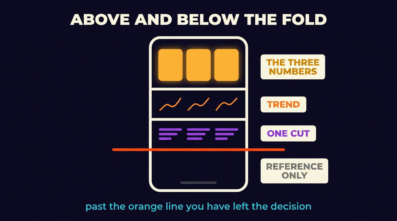
Layer 4: deliberate emptiness below the fold. The space below the segment cuts is intentionally light. It might hold a row of secondary metrics for context, or a link to the underlying tables for the analyst who wants to dig deeper. Scrolling past the segment cut should feel like leaving the decision zone and entering the reference zone. The dashboard doesn't reward infinite scrolling with infinite charts, because every additional chart taxes attention without advancing the decision.
The Forensic Ad Audits work (case study) is the canonical example of this layering. In place of a 100-slide deck, the audit deliverable is a focused document with the three numbers that drove the wasted spend, the segment cut that proved which campaigns were responsible, and a prioritized action plan.
How to pick the three numbers
Picking the three is the work. Most teams skip the picking and inherit whichever metrics the analytics tool defaults to (sessions, bounce rate, conversion rate). Default metrics don't earn their place, because nobody chose them for a specific decision.
The selection process runs in three steps.
Step 1: name the decision. What does the operator decide weekly that this dashboard should support? How much do we spend on paid acquisition next week, and where? That's one decision. Which segment of customers is at the highest churn risk this month? That's another. One dashboard gets one decision, so a dashboard that supports three different decisions becomes three dashboards. Multi-decision dashboards are how you end up with the chart graveyard.
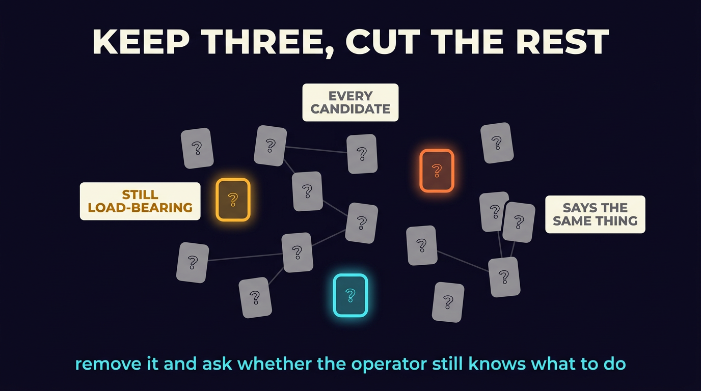
Step 2: list every metric that could feed that decision. The list runs to cost per acquisition, lifetime value, payback period, contribution margin, channel mix, audience segment, attribution-corrected revenue, cohort retention, refund rate, and so on. Generate the full list without filtering. Twenty candidate metrics is normal at this stage.
Step 3: pressure-test each metric by removing it. For each candidate, ask: if I removed this number, would the operator still know what to do? If the answer is yes, the metric isn't load-bearing, so cut it. The metrics that survive the cut are the ones that change the decision. By the end of the test, you usually have three to five metrics. Pick the three that have the lowest correlation with each other (the three that carry independent information). Those are your hero numbers.
The three numbers will look different per category. For ecommerce, the typical trio is contribution margin per order, blended CAC, and 30-day repeat purchase rate. B2B SaaS typically runs on qualified pipeline value, CAC payback period, and net revenue retention. For services agencies, the typical trio is utilization rate, gross margin per project, and pipeline coverage. The trio depends on what the operator decides, and copying another company's dashboard is the same chart-graveyard mistake one level up.
Case evidence
The first case is a home decor cohort dashboard. A DTC metal-art brand had ad-platform dashboards full of CTR, CPM, and ROAS numbers nobody was acting on. The decision-driven rebuild surfaced three: cost per acquisition by buyer segment, average order value by gift-occasion, and repeat purchase within 90 days. The 45-and-over female iPhone gift-buyer segment was visible at the top within a week. Spend rotated to that audience. The brand moved from $10K to $150K monthly. See Home Decor E-Com.
The second is the forensic audit deliverable. The audit format is itself a decision-driven dashboard: a short document with three load-bearing numbers (typically wasted spend amount, audience overlap percentage, and campaign sprawl count), one segment cut that proves the diagnosis, and a prioritized action plan. The audit is intentionally short because the action is the product, not the report. See Forensic Ad Audits.
The third is the solar portfolio brain. One agency had fifty-plus solar accounts, each previously running a per-account dashboard with twenty-plus metrics. The portfolio brain unified them with three numbers per account (cost per qualified install, install close rate, and gross margin per install) plus a portfolio-level rollup. Account managers stopped dashboard-shopping and started decision-shopping. New accounts onboarded faster because the playbook was clear. See Solar Portfolio Intelligence.
Anti-patterns to avoid
Vanity metrics land on the hero row. Impressions, sessions, raw revenue without margin context and follower count look like leadership metrics and behave like decoration. Promote a vanity number to the hero row only when its movement changes the operator's behavior, and most of the time it doesn't.
A number goes on the dashboard with no threshold. A revenue number with no target is a status report. The threshold is what makes the number actionable. Revenue is $87K against the $100K target, with a $75K floor is decision-grade. Revenue is $87K is data.
One dashboard tries to serve several decisions. A screen that tries to support budget allocation, retention strategy, and product roadmap will support none of them well. Split it into three dashboards, each with one decision and three numbers. Operators learn to navigate three single-purpose dashboards faster than they navigate one Frankenstein.
Dashboards belong to the team that built them, not the team that decides. A dashboard owned by the data team will drift toward what the data team finds interesting. A dashboard owned by the marketing director or the CFO will drift toward what they need to decide. The operator who decides is the one with standing to demand changes and accept that other charts get cut.
Where to start
Here are three starting points, from easiest to hardest.
Easiest, do today. Pick the most frequent decision your operator makes. Write the three numbers that, if shown, would change what they do this week. Put those three numbers on a sticky note. If you can't name them in one sentence each, the work is naming them, not building the dashboard. Most operators have a vague sense of the metrics that come up in meetings, not those three numbers. The sticky note is the output.
Medium, this week. Build a v1 dashboard with just those three numbers, a 30-day trend per number, and one segment cut per number. Skip every other chart. Make it ugly if you have to; ship it functional first. The first time the dashboard is the only thing the operator looks at on Monday morning, you have proof the decision-driven structure works.
Hardest, this month. Wire the data layer so the three numbers refresh daily, the thresholds are explicit and visualized, and the freshness SLA is monitored as described in Source to Model, Observed. Add the action zones (color-coded thresholds, alerts when numbers cross). Now the dashboard becomes an instrument that pages the operator when something needs attention, and that's the version that compounds.
A dashboard built around the decision is shorter, sharper, and used. A dashboard built around the data is longer, prettier, and ignored. The work is the metric selection, not the visualization. For the upstream data engineering, see Source to Model, Observed. For why most attribution dashboards lie about which channels deserve credit, see Incrementality over Last-Click.